Client
Totogi

Overview
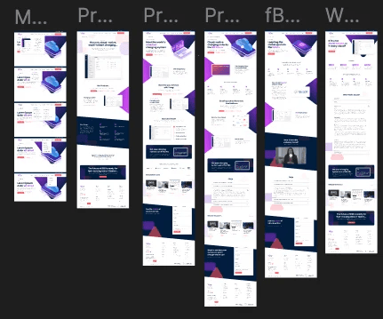
I collaborated with stakeholders and developers to redesign the Totogi website, focusing on enhancing usability, modernising the visual identity, and improving content structure. My role included UX research, wireframing, UI design, and ensuring a smooth design-to-development process.
Client
Totogi
Industry
Telecoms
Service
UI / UX Design
Brand Design
Duration
6 Weeks


The Challenge
The existing website had a complex navigation structure, making it difficult for users to quickly understand Totogi’s offerings. Additionally, the design didn’t fully reflect the brand’s innovative positioning in the telecom industry. The challenge was to create a streamlined experience that balanced technical content with an engaging, user-friendly design.

The Solution
Through a UX audit, I identified key areas for improvement and restructured the site to make information more accessible. The new design featured a cleaner layout, improved navigation, and a refined visual identity that reinforced Totogi’s status as a leader in cloud-based telecom solutions. High-quality imagery, clear typography, and well-structured content helped create a more compelling digital experience. I worked closely with developers to ensure a seamless transition from design to implementation.

The Result
The redesigned site offered a significantly improved user journey, helping users understand Totogi’s offerings more clearly. Following launch, users were able to complete key tasks (like product exploration) 50% faster, and bounce rates on core pages dropped by 35%. Feedback indicated that the new structure and visuals better communicated the brand's innovation and tech-forward identity.