Client
Maldon Salt

Overview
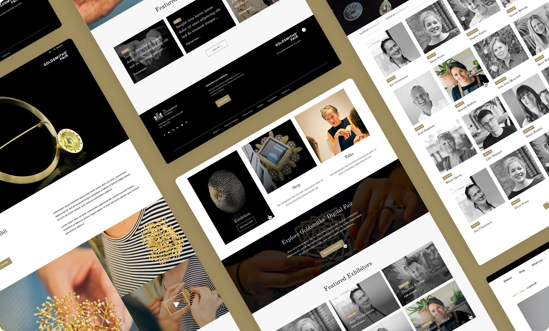
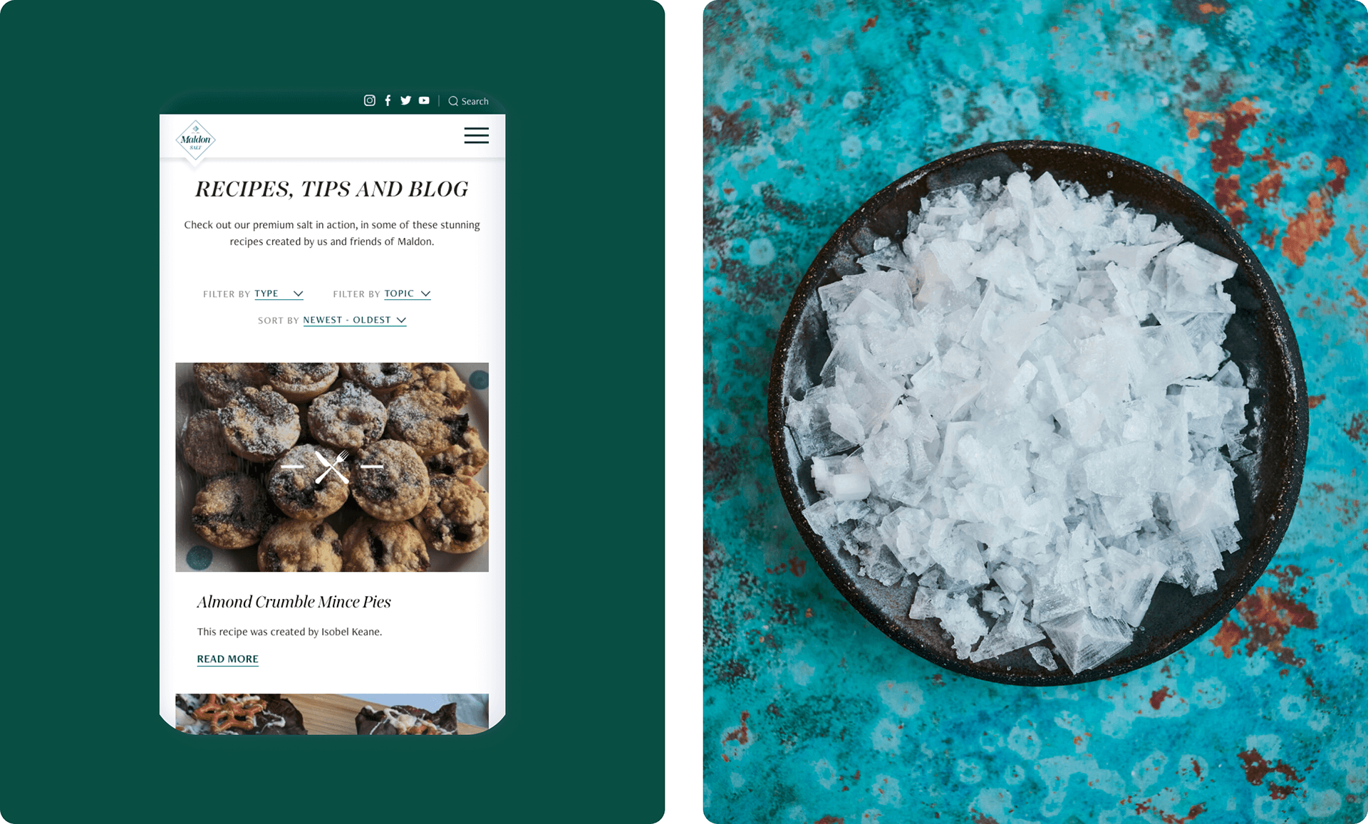
I collaborated with stakeholders and developers to redesign the Maldon Salt website, ensuring it delivered a more engaging and user-friendly experience. My role involved UX research, wireframing, UI design, and working closely with the development team to bring the new design to life while maintaining the brand’s legacy.
Client
Maldon Salt
Industry
E-commerce
Service
UX/UI
Brand Design
Duration
5 Weeks


The Challenge
The previous website lacked a clear structure, making it difficult for users to navigate product information, recipes, and brand storytelling. The design also didn’t fully reflect Maldon Salt’s rich heritage and premium positioning, missing an opportunity to elevate its visual identity. Additionally, the site needed to balance modern functionality with a timeless, artisanal feel.

The Solution
I conducted a UX audit to identify navigation challenges and areas for improvement. The new design introduced a more intuitive site structure, making it easier for users to explore recipes, product details, and the brand’s history. The UI design focused on a refined yet approachable aesthetic, incorporating high-quality imagery, elegant typography, and a layout that guided users seamlessly through the content. I worked closely with developers to ensure a smooth transition from design to implementation, maintaining both functionality and brand integrity.
The Result
The new website delivered a more engaging and intuitive experience, making it easier for users to browse recipes, explore products, and connect with the brand’s story. User testing revealed a 45% decrease in navigation drop-off, and recipe page visits increased by 60%, showing that users were more inspired to interact with the content. The refreshed aesthetic also received positive feedback for reflecting the brand’s heritage.